User-Friendly Dashboard
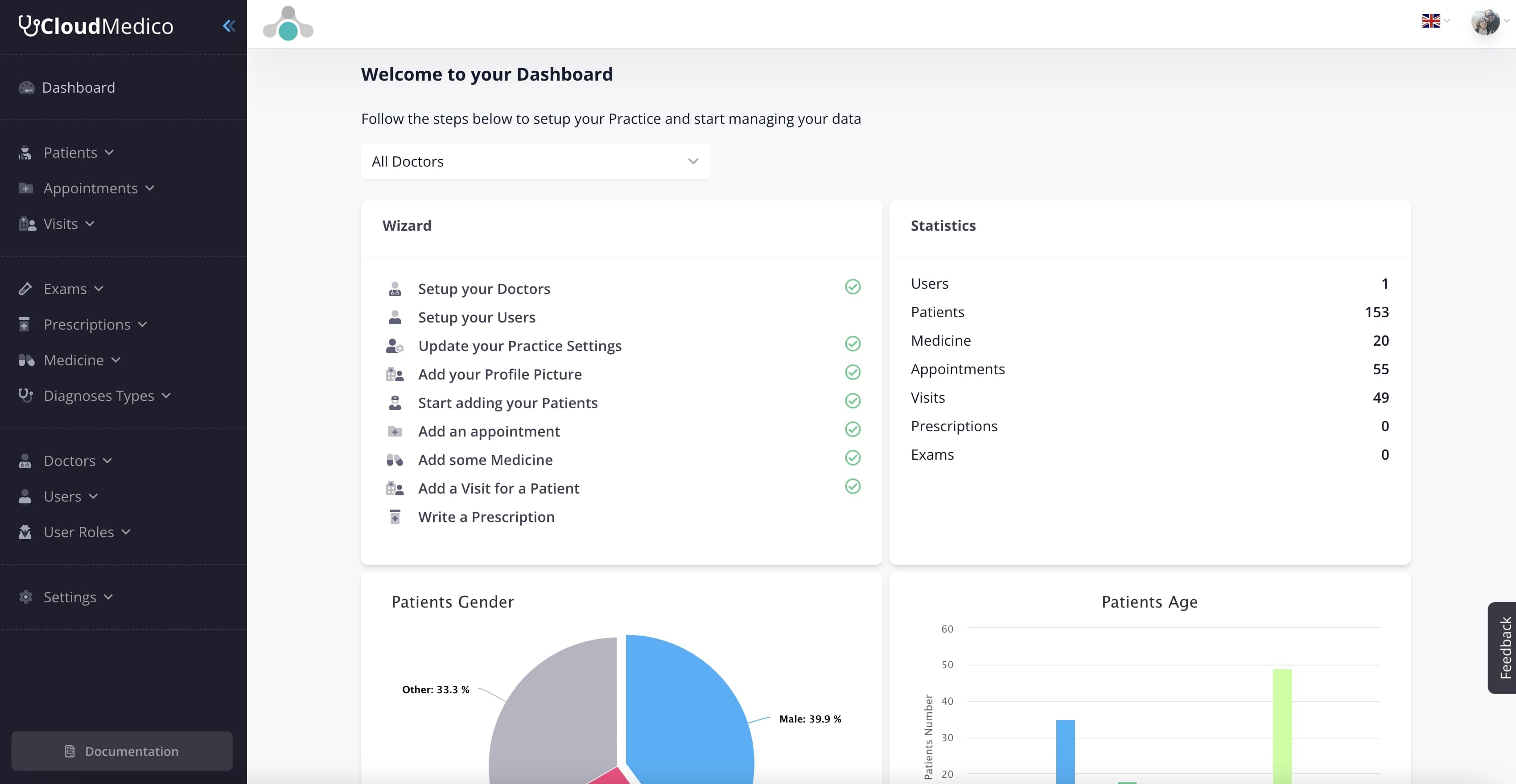
Our User-Friendly Dashboard is the central hub of our platform, designed to provide you with a clear, at-a-glance overview of your practice's key metrics and activities. This intuitive interface serves as your command center, allowing you to quickly access the most important information and navigate to different sections of the platform with ease.
As depicted in the image, the dashboard features a clean, modern design with clearly organized sections. It includes visual representations of crucial data, such as patient demographics, appointment statistics, and visit trends. These charts and graphs allow you to quickly grasp important patterns and make data-driven decisions about your practice.
The dashboard is highly customizable, allowing you to prioritize the information that's most relevant to your specific needs. You can hide/show widgets. This flexibility ensures that the most critical information for your practice is always front and center.
Additionally, the dashboard includes a setup wizard for new users, guiding them through the initial configuration of the platform. This feature significantly reduces the learning curve, allowing new staff members to become productive quickly. With its combination of comprehensive information display and ease of use, our dashboard empowers you to manage your practice more efficiently and effectively.